15 ways to improve your conversion rate for print on demand
Tags
Interested in joining the world's leading print on demand platform?
"A website without conversion rate optimisation is like a car with no wheels — it will take you nowhere."
The above is a quote by Jeremy Abel, Client Strategy Partner at the marketing company, Dialogue. It's a simple statement that paints a clear image of how useless your print on demand store would be without conversions.
Conversions are the lifeblood of your store. They keep the wheels of your business turning. So it is important to work hard on improving your store's conversion rate.
In this article, we're going to take a look at 15 ways to improve your conversion rate for print on demand.
But first: what is Conversion Rate Optimisation (CRO)?
There are typically two types of conversion that you'll need to familiarise yourself with:
- Macro. These are the primary objectives of your website; the big actions that your customers/users can make. For example, making a purchase.
- Micro. Micro conversions for your website are less obvious. These are the smaller steps taken that lead towards a macro conversion. So in relation to your store, this would be activity such as viewing a product page or adding an item to the basket. (In other words, the steps towards the checkout.) However, micro conversions can also be the likes of a sign up to your email newsletters, watching a video, or gaining a follow on social media. Micro conversions are anything that indicates a prospective customer has showed interest or engaged with your brand in one way or another.
Your entire sales funnel is built of both macro and micro conversions and, in a typical customer journey, will look like this:
- Visit website
- View product page
- Add to basket
- Checkout
- Place order
In order to optimise and improve your conversion rate, you need to understand exactly what is happening with these metrics on your site. You need to create and monitor specific benchmarks to help you understand the performance of your store and how to make improvements.
OK, let's dive into our 15 ways to improve your conversion rate for print on demand.
1. Optimise your paid ads
One of the quickest ways to improve your conversion rate is to ensure that the right people (i.e. people who fit your buyer persona) are visiting your store. You can do this by creating online ads across different platforms where potential customers could be hiding.
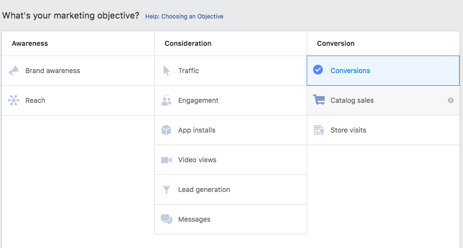
But it's not enough to simply create paid ads, you need to optimise them for the sole purpose of resulting in a conversion. This is actually very simple to do as most ad platforms ask you for the goal of your ads: in this case it's 'Conversions'. Here's what it looks like on Facebook:
If your store is on BigCommerce or Shopify, there are extensions and apps that you can use to work on your Facebook and/or Google ads from within your chosen platform. Here are links to a few:
By selecting conversions or sales as your ad goal, you can rest assured that the power of the Google and/or Facebook algorithm will be working towards improving your conversion rates.
2. Free shipping
In the competitive ecommerce world, free shipping can be an instant deal breaker for an online shopper browsing your site. It's a great way to incentivise shoppers who are sensitive to extra charges when they're teetering at the checkout.
Consider setting a minimum purchase threshold in order to avoid getting stung. This way you can guarantee your profit margin on orders will remain secure, while still providing something 'free' to your customer. In some instances, this can even encourage customers to increase the value of their order to meet the criteria for free shipping.
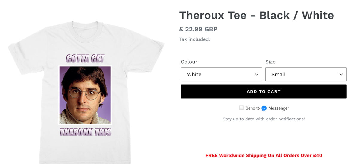
Another way to implement free shipping into your strategy without losing out is to incorporate the cost of shipping into your product prices. You'll need to do some number crunching to work out your average shipping price across regions. The good news is that even though your prices will be higher on the store front, the prospect of getting free delivery will act as an incentive to get people hitting that buy button. It's also known to reduce cart abandonment.
It's all in the psychology. According to a consumer survey by Return Customer, 93% of participants preferred free shipping when given an option between discounted items or a bonus item with purchase, assuming the same value for each.
3. Include discount codes
Just like free shipping, discount codes can also incentivise website viewers to make the leap from window shopper to converted shopper.
By offering discounts, you can also grow your email list (which is very useful for future marketing campaigns) by asking users to enter their email address in order to win a discount.
There are many different ways that you can offer discounts to your customers. You can send emails out to your current customers (via your email list) to encourage them to return:
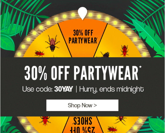
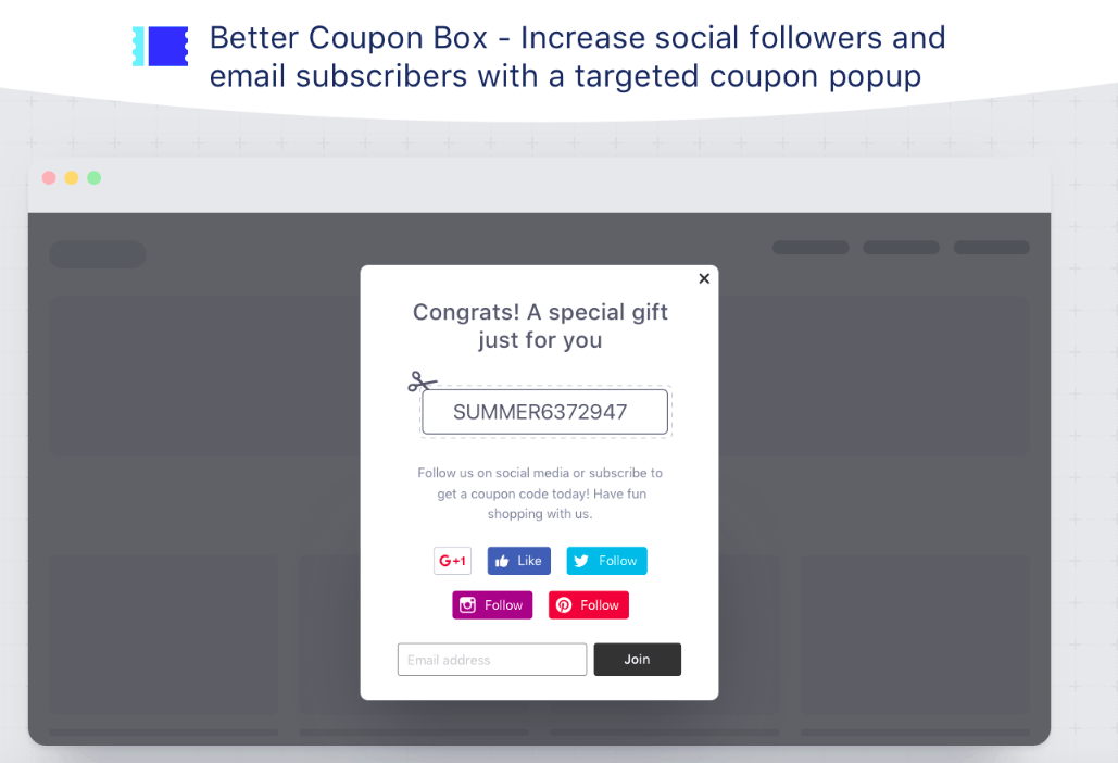
You can also set up an entry or exit pop-up that will encourage website visitors to visit more pages on your site and, of course, make a purchase. Better Coupon Box is a free app for BigCommerce that allows you to do just that:
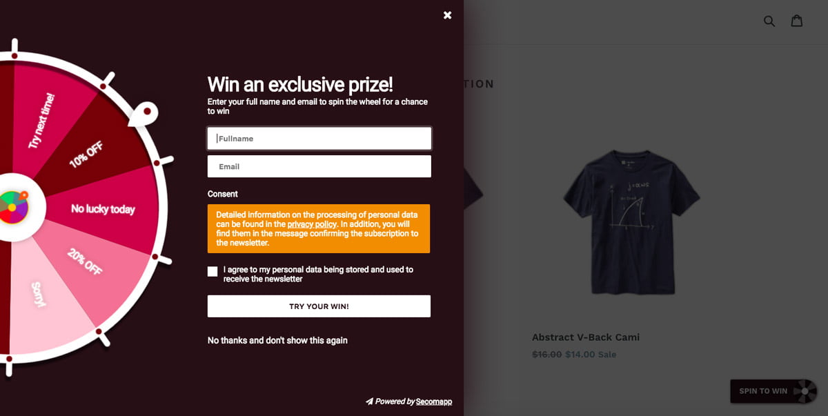
If you want to mix things up, you can also gamify the experience for your shoppers. The free Shopify app, Spin to Win, allows you to enter ten different offers for potential customers and then encourages people who are browsing your site to spin the wheel and win!
4. Use cart abandonment software
According to a recent survey, online shoppers abandon their shopping carts at a rate of 70%! It may seem inevitable, but there are measures you can take to decrease the risk of this happening.
Privy is a free exit pop-up app (which works with both Shopify and BigCommerce) that has a neat, little feature called Cart Saver. A 'Cart Saver' is a pop-up that is linked to your checkout page, so if it looks as though a user is going to close the window (and abandon their cart) a pop-up will appear, usually with an offer to encourage the user to convert:
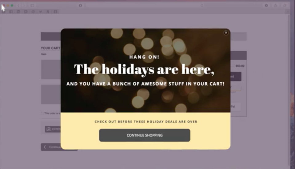
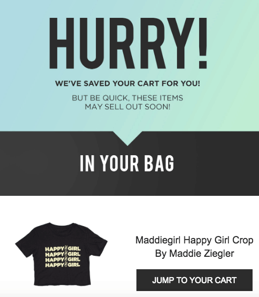
If a user still abandons their cart, then you can also set up an email nurture sequence within Privy to encourage them to come back and finish their shop. According to a Klaviyo report, ecommerce brands who send a series of two or three emails about abandoned carts generate more revenue.
With a little bit of effort you could set up an automated abandoned cart email sequence that once live requires no further effort, but which can have a surprisingly good effect month-after-month in improving your revenue.
5. Quality product images
Online shopping trumps in-store shopping in many ways: you can do it from the comfort of your sofa, you can usually find a better deal, and you can get products delivered directly to your door. But consumers still have some concerns about shopping online, and one of those concerns is quality.
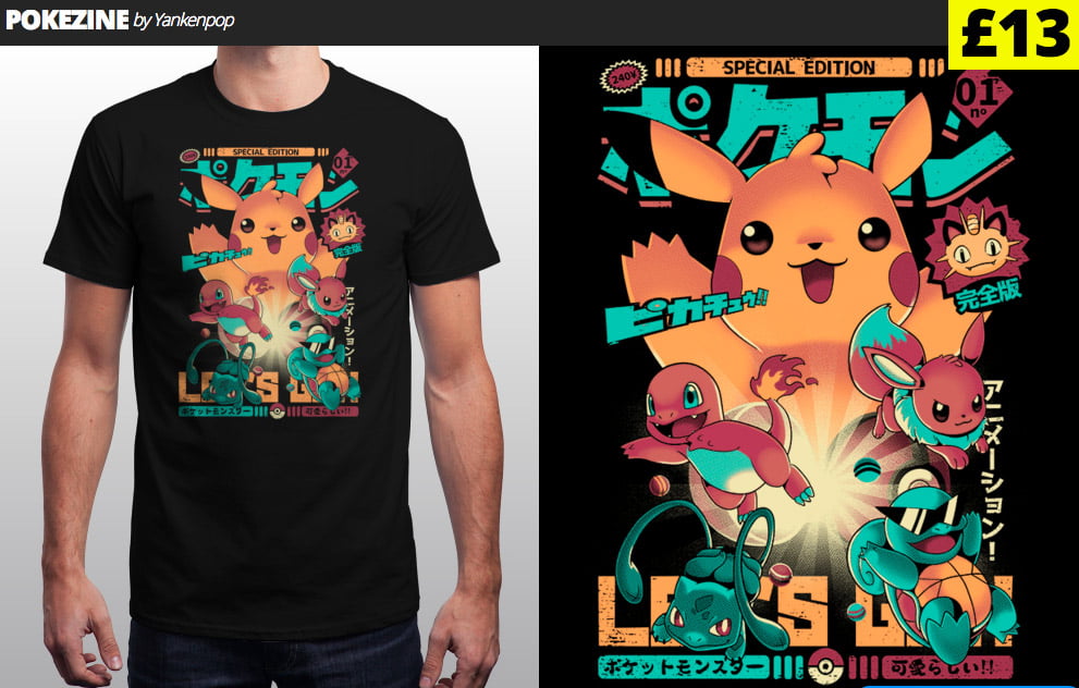
To ease the doubts of potential customers visiting your site, you need to have quality product images on show. Online shoppers can't touch and/or physically see the products they are buying from your site, so you need to give them peace of mind about the quality of the item they are buying, and you can do this with amazing product images. Yes, images plural!
According to a SmartInsights study, offering multiple product views and other alternative images leads to 58% more sales.
For advice on how to create amazing product images, check out our previous articles:
- 15 great product photography ideas to help you sell more
- Building a product photography set-up to sell more
6. Show customers that your store is secure
Continuing with the theme of barriers to online purchases, another big concern for online shoppers is security. SmartInsights found that 40% of online shoppers would have more confidence in a shop that had more than one payment method and 59% of people will abandon a transaction if their preferred payment method is not in place.
The same study also found that 80% of consumers feel safer when they see trustworthy card logos displayed prominently within an online store, like this:
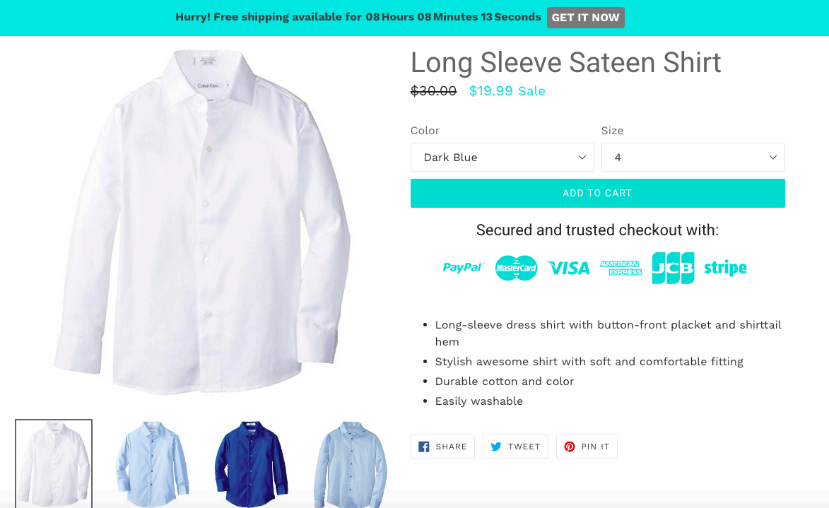
It's very easy to add badges like this to your print on demand store with Shopify and BigCommerce. The above example is from a free Shopify app called Free Trust Badge. A similar BigCommerce equivalent would be the McAfee SECURE app.
7. Always show shopping cart contents
When looking to improve your conversion rate, you don't always need to make huge changes to your site. Sometimes, simple tweaks can be just as effective–like ensuring customers can always see the contents of their shopping basket or cart.
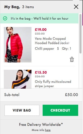
This ensures that shoppers know exactly what they are buying, and how much their total will be, so there are no surprises at the checkout!
8. Let customers buy products as a 'guest'
After spending a good amount of time browsing and deciding which products you want to buy, when you finally get to the checkout stage it can be really inconvenient to create a login. Even though it only takes a couple of minutes, being asked to sign up can deter people from converting. In fact, according to an infographic by Crazy Egg, 14% of people cited their reason for abandoning carts as they "did not want to create an account with the merchant".
To avoid losing out on these customers, consider adding an option for shoppers to checkout as a guest.
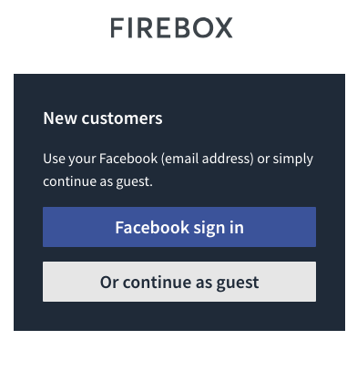
You'll still need to ask for most of the things you ask for when users sign up, e.g. email address, delivery address etc. but because of the implied convenience, people will be more likely to hand over this information.
9. Simple site navigation
You can probably see a pattern forming here: the main way to improve your conversion rate is to make the shopping experience convenient for shoppers.
Part of that is having a website that is clean, simple, and easy to navigate. There are literally millions of websites for shoppers to choose from, and with so many competitors, you need to make sure your site is the best-looking and easiest to use. With so much choice at their fingertips, shoppers won't spend time on a site that is broken, glitchy, or slow.
This is where using dedicated ecommerce platforms like BigCommerce and Shopify is a real bonus. Why? They are built for the specific purpose of generating online sales. Most of the themes, including the free ones, will feature simple and streamlined site navigation out of the box.
The bottom line is: you need to make it as easy as possible for people to convert. Get your friends and family involved — ask them to test your site and give you feedback.
10. Optimise for mobile devices
Half of ALL internet traffic comes from mobile devices, with 65% of adults aged 18-24 using their smartphone for online shopping. On top of that, Google has now started to index mobile sites first for SEO, so your site needs to be just as beautiful and functional on mobile as it is on a desktop.
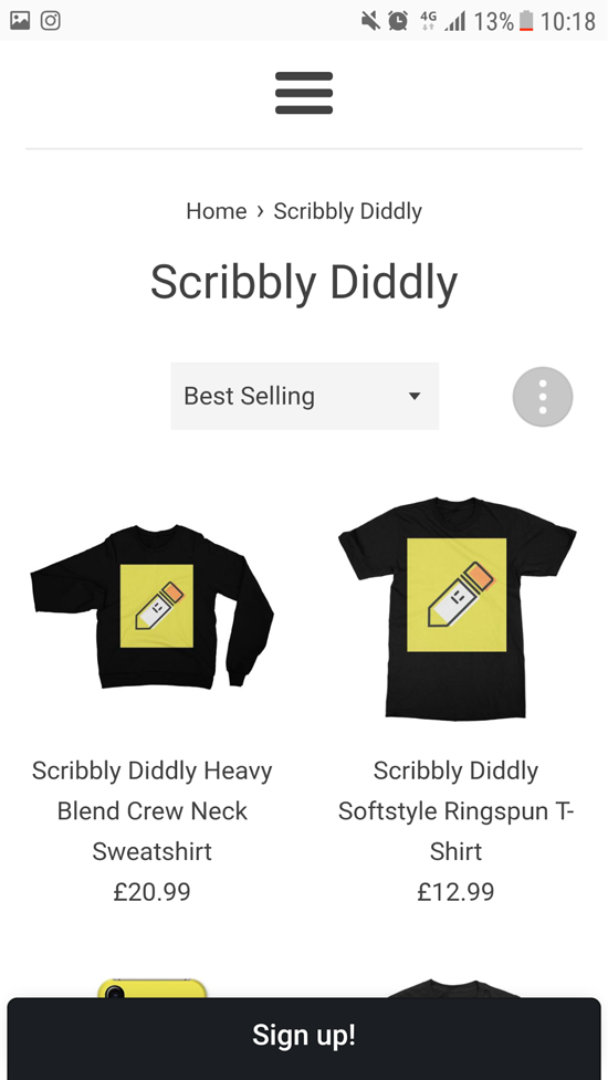
As screen size on mobile is often a lot smaller than desktop, navigation is probably one of the key things you're going to want to optimise. If all your navigation will not fit easily onto a mobile screen, experiment with a small and non-invasive 'hamburger' style menu (like the example above).
Luckily, if you're already using Shopify or BigCommerce to host your print on demand store then your site should already be optimised for mobile. But there are ways you can further optimise your mobile site, if you want to stay ahead of the game. Here are some articles from both sites that explain how to further optimise your site for mobile in their own words:
- Shopify: 5 Simple Hacks for an Optimised Mobile Design
- BigCommerce: Optimising Your Design for Mobile
11. Include exit intent pop-overs
We mentioned Privy above and their 'Cart Saver' feature, but exit intent pop-overs are also great for any page on your site, not just the checkout screen.
If a website visitor clicks away from your store without doing anything (e.g. clicking or purchasing) then this sends a bad signal to search engines that your site isn't 'useful' or 'applicable' to the search term that the user entered. This can increase what's known as your bounce rate.
By using an app like Privy, you can show consumers an amazing offer that will keep them on your site, reduce your bounce rate, and hopefully increase your conversion rate.
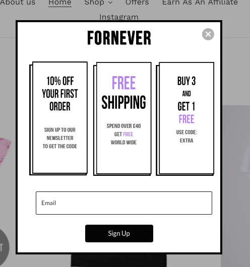
Exit intent pop-overs are also great for capturing email addresses and building your email list. When you have a list that is big enough, and filled with people who love your store, it will soon become your highest converting channel.
12. Prominent CTA buttons
This one is another simple tweak, but it can be surprisingly effective.
A "Call to Action" (CTA) is a button on your site that serves the specific purpose of eliciting a conversion from your visitor. If shoppers can't see your call to action buttons, how can they click on them?
Don't risk that happening. Make sure your CTA buttons are as bold and as prominent as possible.
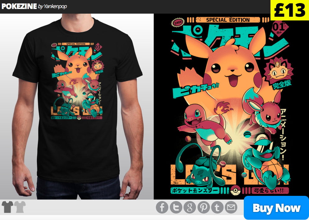
It's not just about size either. The colour of your CTA buttons can also have an impact on your conversion rate. According to a study by Real Simple, the colour blue connotes trust and dependability and can actually increase customer loyalty–with customers 15% more likely to return to a store with blue colour schemes over orange. It could be just a bit of hocus pocus, but it's a simple test that may be worth carrying out.
13. Provide clear product specification details
When selling personalised products, like print on demand clothing, sizing and fit are very important. By providing clear sizing information and product specifications, you can increase consumer confidence and encourage them to hit the purchase button.

Another benefit of clear product specification guidelines is that it reduces the chances of customers wanting to make returns. However, it is always important to include clear links to your shipping and returns policy. As long as your return policy is clear and fair, this should show customers that you are a store that can be trusted.
14. Live chat software
Live chat software is very quickly becoming a 'must-have' for online retailers. Shoppers expect instant communication 24-7-365, and live chat software is one of the most efficient and cost effective ways to offer this.
According to a study by Forrester, live chat leads to a 40% increase in conversion rate and a 10% increase in average order value.
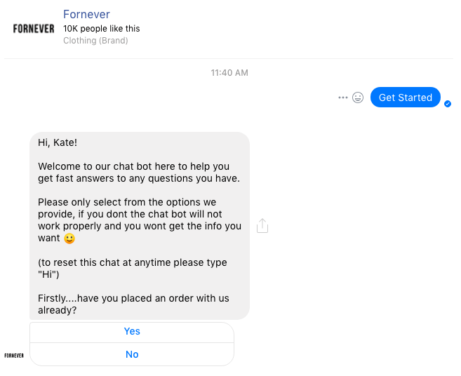
Within both BigCommerce and Shopify there are live chat apps available. One of the most popular is Tidio. Tidio merges bots and marketing automation to meet the expectations of customers, and have reported to increase sales by as much as 40% for their clients. Another great option is to explore the use of a Facebook Messenger chat tool integrated with your website — particularly if you are already very active on Facebook.
15. Encourage customers to review your products
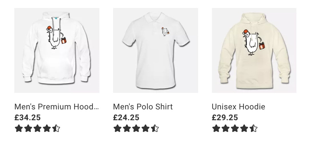
Even in the online world, word of mouth is powerful. According to Forbes online reviews have been shown to impact almost 70% **of purchasing decisions, with **84% of people saying that they trust online reviews as much as personal recommendations.
With reviews carrying so much weight, you need to make sure that your store is full of them! Encourage your customers to review your products by sending a follow up email after purchase.
Thanks for reading
Fortunately, you don't need to reinvent the wheel to improve your conversion rate for print on demand. By making a couple of tweaks here and there, you can improve the customer journey and increase the amount of people who convert when they visit your online store.
Our advice is to treat each tactic as its own "growth experiment". Establish your current conversion rate benchmark, implement one of the above tactics and then measure again. Did it help improve your conversions? Are there any lessons to be learned? Move on to the next!
Remember, in order to truly improve your conversion rate, you need to constantly track, monitor, and study your benchmarks.
