The art of colour matching: A beginner’s guide to colour profiles
Tags
Interested in joining the world's leading print on demand platform?
When it comes to reproducing your designs on our print on demand products, we know how important it is to do them justice, and that includes getting the colours right — not just for your sake as the designer, but also for the sake of your customers.
During the print on demand process, your designs undergo a series of changes: transitioning from a physical product into a digital image, and finally from a digital image back into a physical product.
In this blog post, we’ll explain exactly what a colour profile is and how to use our colour profiles to get the best colour match for your custom printed products.
What is a colour profile?
A colour profile (or ICC profile*) is a piece of software code that ensures precise and consistent colour management by describing the range of colours that a specific device can input or output, such as a scanner, monitor or printer. When an image transits through multiple profiled devices (i.e., from a scanner to a monitor and then to a printer), the output will reflect the colours recorded by the capture device. If the devices aren’t profiled, the results will be inconsistent.
Think of colour profiles like translators translating a message being communicated between three people, none of whom speak the same language. The message (colour information) is passed from person to person (device to device) and subsequently translated by each translator (colour profile). Of course, the translation won’t be perfect, but it’ll be pretty close — and the same goes for the colours used in your designs turned custom products.
* In case you’re wondering, ‘ICC’ refers to the International Color Consortium — the organisation that came up with this particular colour management system.
Colour management glossary
Interested in learning more about the colour management process? Keep scrolling for a quick crash course…
Colour model
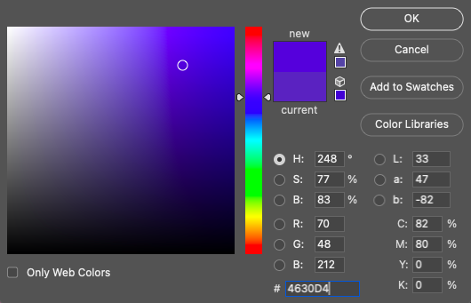
A system used to describe a colour numerically, such as RGB or CMYK.
RGB
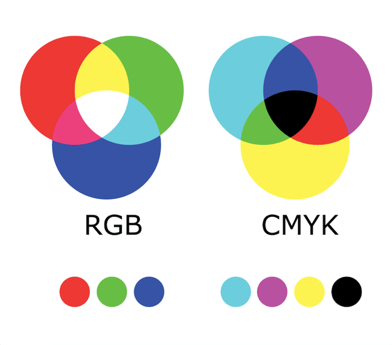
An additive colour model (based on transmitted light) — which comprises the colours red, green and blue — typically used for working with on-screen designs. It’s also the colour model we use for printing since it supports a far wider gamut than CMYK.
CMYK
A subtractive colour model (based on reflected light) — which comprises the colours cyan, magenta, yellow and key (black) — typically used for print work.
Colour space
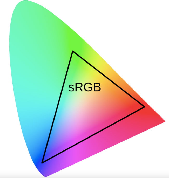
A defined range of colours produced by colour models used to describe a device’s ability to interpret colour information, such as sRGB or Adobe RGB.
Colour gamut
A range of colours represented within a colour space.
Colour value
A combination of decimals and/or letters used to represent a colour’s degree of lightness or darkness.
How to use our colour profiles to get the best colour match for your print on demand products
Before we get stuck in, please note that the following guidance is based on the assumption that your monitor is already calibrated and your output devices (i.e., printers) already profiled, including the papers and inks that you use. If these steps aren’t carried out, you won’t be able to accurately proof your work using our colour profiles. Instead, we advise that you compare our physical samples with our sample print files to see how different they look from the printed result, before making any necessary adjustments.
- Scan or transfer your design to a computer, and open the image file ready for editing in an application such as Adobe Illustrator or Photoshop.
- Head over to our downloadable assets page, and download the colour profile for the product you’re creating.
- Once installed, you can then use our colour profiles within your own calibrated proofing workflow. Just so you know, our colour profiles act as destination profiles in that they contain information about our output devices, therefore should be used in conjunction with colour profiles for your own.
- During the editing process, please ensure that you’re using a color space based on the RGB color model. We also ask that you don’t embed our colour profiles into your image as these are purely for print proofing only. The majority of our processing systems have been programmed to ignore designs that come through with colour profiles, however we still recommend that you don’t include them in case your design ends up being altered during production.
- Once you’re happy with how your design looks, you can go ahead and create your order. Search for and select the product you wish to customise, upload your edited image to your order, fill in your order details, then submit it to us for fulfilment.
Colour management is a core principle of The Prodigi Promise. We’re constantly calibrating our scanners, monitors, printers and software to ensure that the colour of your prints precisely match the previews generated by our platform. That being said, if you do find yourself unhappy with the finished product, we’ll happily provide you with one free reprint. Simply tweak your design as desired, and resubmit your order with the amended image. Alternatively, you can also use a colour management service such as Color Confidence, who’ll be able to give you lots of great advice on how to manage your colour.
Now that you’ve got colour matching down to a fine art, why not go one step further and check out our blog post on how to prepare the perfect print on demand image file?
